Get to know the tools, purpose, and people behind the project
The “Three Layers” of Our Project
Presentation
For our project we are using a dataset called “The Museum of Modern Art (MoMA) Collection”. This dataset includes a table for the artists featured in the MoMA as well as a table for the artworks feature. The “Artists” table provides information about artist name, date of birth, nationality, and gender. The “Artworks” table tells us the artwork name, artist name, artist gender, and the date the artwork was catalogued at the MoMA. Both these tables together create a strong foundation for establishing insight into the artworks and their artists presented at the MoMA, but there are some gaps in information. For example, many rows have missing or NA values in vital columns like Gender or Nationality. Or, some fields are filled but with confusing or inconsistent data. Many fields in the Nationality column were represented in different ways (i.e. American vs United States). In the Artworks table, essential fields like Dates, Medium, Dimensions, and On-View Status varied widely in both completeness and precision. Open-ended fields such as CreditLine and ArtistBio created further inconsistency which made it difficult to easily analyze patterns or representation across demographics. When we combine these two tables, greater inconsistencies come to light. Artworks often have multiple creators, some lack valid ConstituentIDs, and uncertain demographic information affects the accuracy of representation-based analyses. Overall, while the datasets allowed us to explore meaningful questions about artistic representation and collecting practices, the irregularities and gaps in information required caution, cleaning, and careful interpretation. Other sources we used were found through academic journals databases like JSTOR, which allowed us to find relevant articles pertaining to our research question. Our sources span most of the length of the MoMA’s collecting history, which allows us to walk through the steps towards greater representation for women over the years. We get some really insightful analyses written by feminist art curators which allow us to touch on the nuances of representation in the art world. Choosing these sources was based on criteria of relevance to our project and narrative. There were many sources that had a lot of important information, but weren’t completely tied into our narrative, so we had to work to weed through what would actually help us build a cohesive story.
Processing
For this project, we used the MoMA’s Artists and Artworks datasets, which were imported and analyzed in Tableau. After loading the datasets, we conducted an initial data cleaning process that included standardizing date formats, extracting usable fields (such as Birth Year and Acquisition Year). We also created several fields such as Birth Decade, Acquisition Year, and Gender Cleaned to make the dataset more analyzable and consistent across visualizations. To visualize MoMA’s acquisition history, we constructed a line chart of artworks acquired per year by placing Acquisition Year on the Columns shelf and using COUNT(Constituent ID) as the measure on Rows. We then filtered the data from 1929–2024 to show MoMA’s acquisition trends across its institutional lifetime. For our gender representation visualizations, we used the cleaned Gender and Birth Decade fields to group artists into ten-year cohorts. We counted unique artists per decade using COUNTD(Constituent ID) and applied a Percent of Total table calculation to generate 100% stacked bar charts that compare gender distribution across time. This allowed us to examine shifts in institutional recognition of women and other gender groups in MoMA’s collection.
Presentation
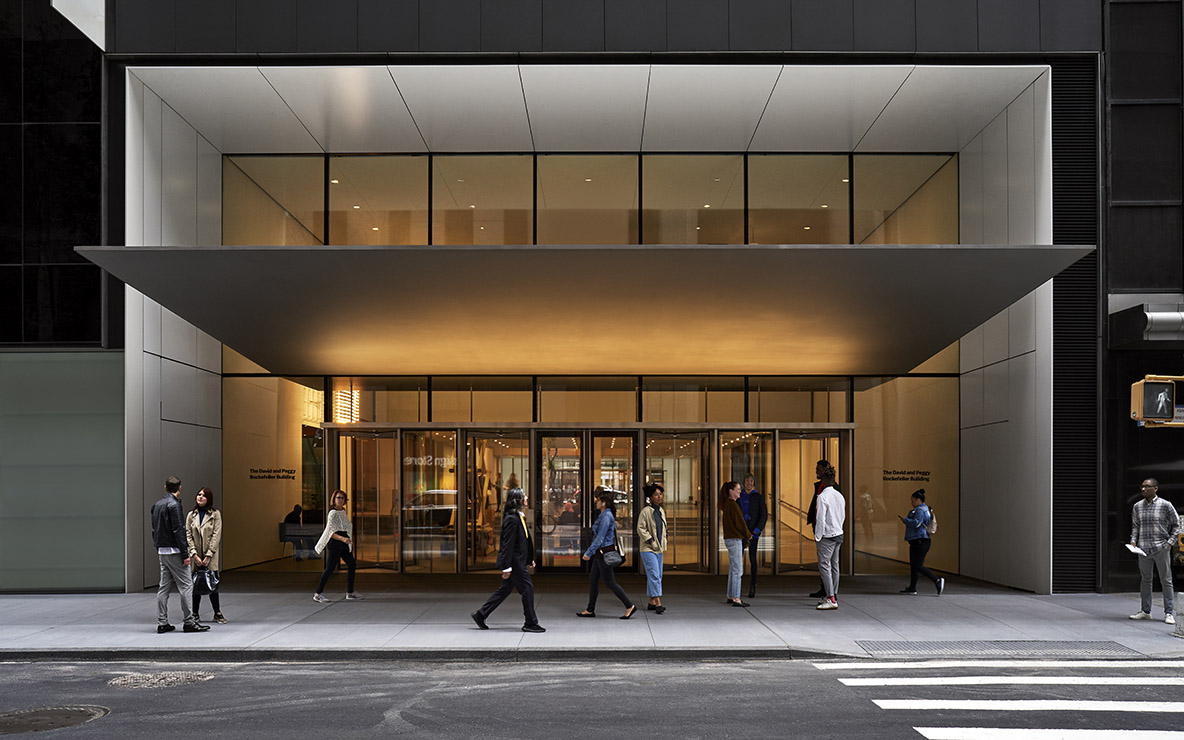
For our project, we used the website-designing platform WordPress to develop and customize our site because it provided intuitive design flexibility, built-in accessibility features, and an easy-to-manage content structure that fit our timeline and goals. We selected a clean, modern theme with light backgrounds and dark typography to ensure high contrast and readability. Our muted color palette was intentionally chosen to align with the visual identity of the MoMA, evoking its professional and minimalistic aesthetic. The design emphasizes simplicity and white space, allowing our visualizations and research findings to stand out as the focal point. To enhance accessibility, we included descriptive alt text for every visualization and map, and embedded hyperlinks into relevant contextual text to support smooth navigation for screen-reader users. These choices reinforced our goal of making the website not only visually cohesive but also inclusive and user-friendly for a broad audience.
Meet Our Team
Dai Le
Project Manager/Web Designer Hi, my name is Dai and I am a third year Cognitive Science major. As the project manager and web designer, I oversee the completion of the project from start to finish, delegating tasks to my team members, and creating an appealing, functional, and user-friendly web page. My favorite female artist is V?
Ellie Huang
Web Designer/Editor Hello there, I’m Ellie, a third year Cognitive Science major with a minor in Digital Humanities. As the web designer/editor for our MoMA project, I am in charge of reviewing all content and ensuring that we have a cohesive, consistent, and human-centered design for our web. My favorite female artist is Helen Frankenthaler.
Xu Wang
Editor Hi, my name is Xu Wang and I am a fourth year Economics major. As the project editor, I am responsible for editing all of our written and visual content. I ensure that all elements of the project are present and edits the narrative to correct organizational, spelling, and grammatical errors. My favorite female artist is Olga Rozanova.
Zoya Omair
Content Developer Hi there, I am Zoya, a fourth year Psychology major with a minor in Digital Humanities. I am the content developer for our team, which means I am involved in establishing our team narrative and making sure all content flows cohesively. My favorite female artist is Georgia O’Keefe.
Maya Hirsch
Data Visualization Hi, I am Maya, a fourth year Statistics and Data Science student. I am doing data visualization for our team, which means I transform the dataset into visuals that highlight patterns in artist representation at MoMA and help illustrate our findings. My favorite female artist is Mary Cassatt.
Roey Lian
Data Specialist Hi, my name is Roey and I am a third year Statistics and Data Science major. As the data specialist, I tracked the representation of female artists in the MoMA collection across different periods by cleaning and organizing the data on collections. My favorite female artist is Hannah Höch.
Acknowledgement
To Professor Wendy Perla Kurtz: Thank you for always bringing enthusiasm to the classroom and for introducing us to Digital Humanities. Through your lectures and the resources you provided, we were able to learn the foundational digital tools and text analysis skills that made this project possible.
To TA Kai Nham: Thank you for your support and feedback throughout this entire project. Your help, especially with navigating technical issues, contributed to the success of our project and we truly could not have completed this work without your guidance.
AI Use Note: AI used for narrative editing and help with in-text citations
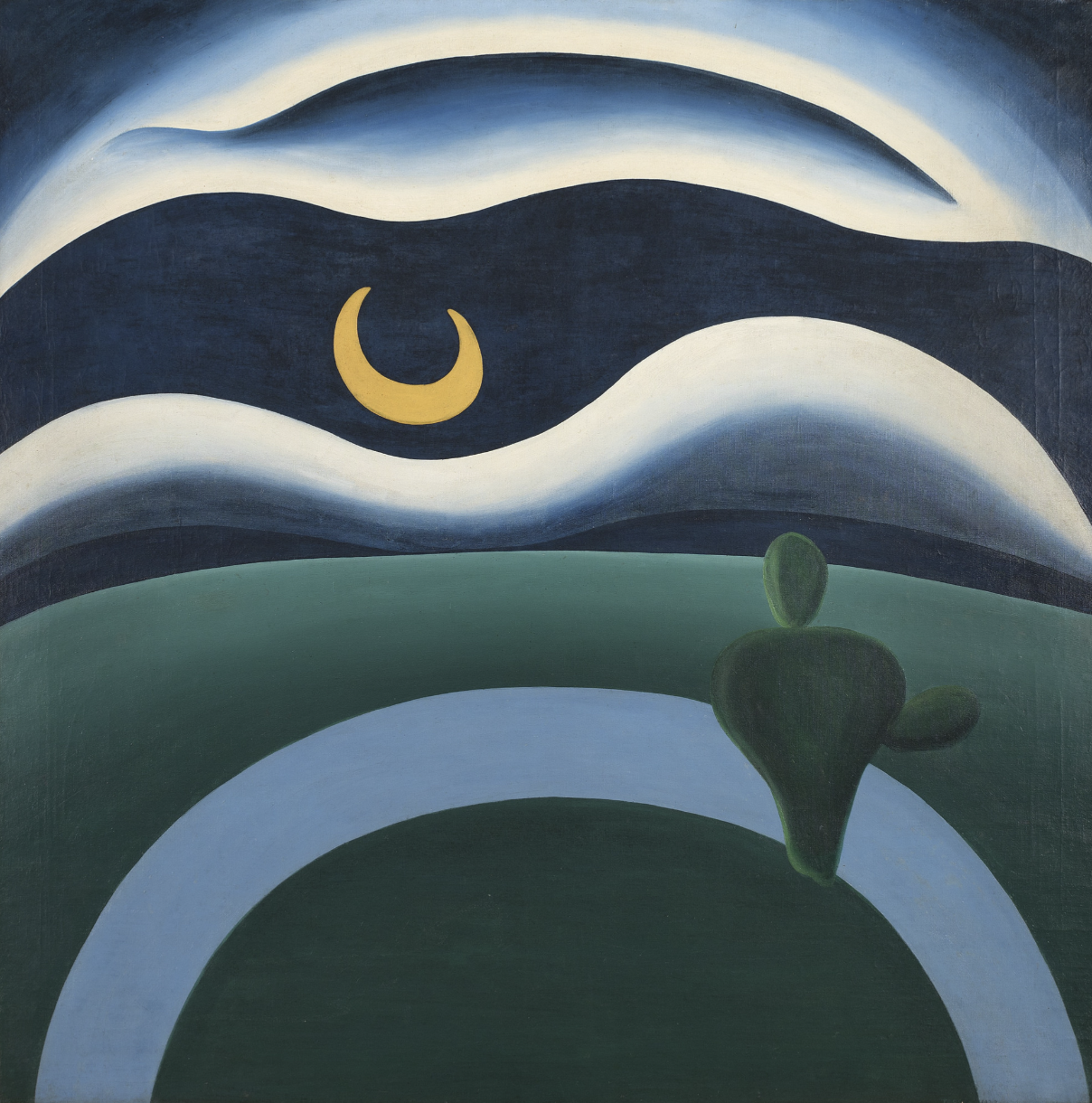
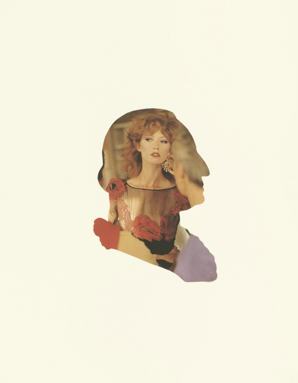
Tarsila do Amaral’s The Moon. The Museum of Modern Art, New York Sherrie Levine. President Collage: 1 (detail). 1979. Cut-and-pasted printed paper on paper, 24 x 18″ (61 x 45.7 cm). The Museum of Modern Art, New York